Do iT Right First Time
The Technology Tamer
Web Trap #1: I’ll just create a few pages, then organize them later.
It is important when we begin authoring for the web that we decide on the structure in advance. If not, we have those famous links that go nowhere and graphics that don’t appear.
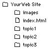

| A simple structure may consist of your main index.html document with an images folder at the top level. Also at this top level you may have folders for each of your main subtopics. |
Recognize that you can go back and change this structure, but it will take a lot of work and attention to detail.
Web Trap #2: How deep can you go?
While we’re discussing structure, it is important to be kind to your readers and don’t make them click through 15 layers to get to the piece of information they want. Behind the scenes you may have the information in 15 folders, but your user should not have to navigate all of those folders. Instead, use frames or menus to provide access to a lot of information quickly. It is not unusual to have an item repeated in many places, as appropriate. For example, if you have a directory of members in your club site, you might have a link to that listing from the main page, from a special members’ page, from individual members’ pages, etc. Give users multiple paths to get to information quickly without having to drill down through all the levels.
Web Trap #3: Of course we can put all of the policies online — on one page.
This is the opposite of the site that is too deep. Instead, this trap tries to tell you everything at one time. This slows the page download time considerably, as you wait for the text and graphics to download. In the same amount of time, users might have been able to navigate two or three topics, rather than waiting for the single long page. When you feel compelled to put more information than two screens of information on a web page, include a “menu” at the top of the page so that users know what is available further down the page and can click to get there. The one instance in which a long page is appropriate is for a FAQ (frequently asked questions) document. Since many people want to print this page for later reference, it is considered appropriate to include all of the information on the page.
Web Trap #4: Would I use a cake mix?
There is sometimes a misplaced pride in doing everything “from scratch”. If the result is the same, why not use a “mix”? There are many good HTML authoring programs on the market today. All of them let you add your fancy touches in raw HTML code, when appropriate. For example, I create most of my web pages in Claris Home Page. This lets me put in the text and graphics as I would in a desktop publishing program–WYSIWYG (What You See Is What You Get). This program even converts my graphics to GIF files and lets me set the transparency. Once I have the layout complete, I can edit the HTML code that the program generated, adding code that is outside the realm of the program. This process cuts my development time in half!
Web Trap #5: It’s a gorgeous picture!
It may be, but if I have to wait 10 minutes for it to download, I don’t want to see it. If you are putting more than 2 or 3 graphics on your page, consider using thumbnails. These 75 by 75 pixel graphics are a rough draft of the larger, more detailed picture. Most web-friendly graphics packages have a setting to resize a graphic to a thumbnail. Generally, users who want the more detailed photograph should be able to click on the thumbnail and wait for the download. In this way, you let the user decide.
Web Trap #6: Let me show you all of the multimedia tricks I know.
One of the strengths of the web is its ability to convey sounds, motion, graphics, and even movies. That does not necessarily mean you should use them. Consider the purpose of a multimedia element. Does it convey content to a better extent than text or a static picture? Does the motion add to the quality of information? Unless you are creating a site to show off multimedia, use it sparingly. Many experienced web users are beginning to “tune out” and turn off sites that take a long time to download and consistently keep your hard drive running, accessing the multimedia elements.
Web Trap #7: But the school colors are blue and orange!
Fine. Use your special colors in the graphic header or in a logo on each page. But remember that there are only about 250 standard colors that look good on all computers using the web. There are standards for having blue text underlined to indicate a link. When you begin to change those standards users get confused. If they are confused, they are uncomfortable and won’t visit your site again. Consider the impact of colors when designing the page. For readability, dark text on a light background is easiest on the eyes. For impact, light letters on a dark background is most memorable. So consider a splash screen with a dark background and the main menu and other pages with light backgrounds.
Web Trap #8: Don’t leave a clue.
Like most web users I have found my use of page increasing. Why? Because I don’t want to take the time to read all of that great information while I’m online, so I print it out. Often when I’m reading there is a reason I want to get back to that site; however, few of the pages I’ve printed contain a URL for that page. Get into the habit of putting the URL at the bottom of each page. For example:
Web Trap #9: Okay, it’s finished.
A good web site is never finished. There is dated information that needs to be added or deleted. There are new developments relevant to a topic. There is new software to share. There are new formats and ways of presenting information that need to be incorporated. If your site is not changing on a weekly basis, you probably don’t have a lot of repeat visitors. You have a dead web site. There has to be a reason for visitors to come back.
Web Trap #10: Okay, I’m finished.
In this rapidly evolving field there is always more to learn. Standards are changing. HTML has gone from version 1.0 to version 3.2 is a little over a year. “Experienced” web authors are those who had a web site up as early as 1995! You must read and experiment continuously. Consider rereading items you read last month. For example, in researching this article I reread information I had covered not more than 60 days ago. However, I learned a new technique I had not learned the first time through because I did not yet understand enough to know why I needed it. Needless to say, that information has been incorporated into my “bag of tricks” and will appear on the web as soon as I finish this article.
Dr. Jeanette Cates, The Technology Tamer™, is a consultant specializing in the planning, implementation, and assessment of technology. She is the founder of TechTamers, a training and consulting company. Dr. Cates is the author of the Web Site Design course, offered by the T.H.E. Institute, and is the creator of more than 30 websites. Dr. Cates speaks frequently on the creation and support of online communities.
here are some tools from this author
Get started with Internet Marketing the right way
Internet Marketing Quick Start – A Full 5 Hours of Complete Beginner Training
You Will Learn More In 5 Hours Than If You Spent The Next 2 Years Trying To Do It On Your Own!
8 Hour Website
“How to get your website online in 8 hours or less!
39 Trackbacks / Pingbacks to
1fairy-tale Comment on Do it Right First Time : September 2nd, 2022 at 12:16
2suffocation
gay perv chat group Comment on Do it Right First Time : September 2nd, 2022 at 20:07
gay chat rooms https://newgaychat.com/
gay masturbate chat Comment on Do it Right First Time : September 3rd, 2022 at 04:32
free gay chat 803 area code https://gaychatcams.net/
gay chat chat Comment on Do it Right First Time : September 3rd, 2022 at 06:20
gay chat no registration https://gaychatspots.com/
chat gay miami Comment on Do it Right First Time : September 3rd, 2022 at 10:46
gay chat pittsburgh https://gay-live-chat.net/
gay video chat sites realty to dirty roulette Comment on Do it Right First Time : September 3rd, 2022 at 17:52
free gay boy video chat https://chatcongays.com/
gay webcam chat sites Comment on Do it Right First Time : September 3rd, 2022 at 22:12
gay chat porn https://gayphillychat.com/
gay chat with married man Comment on Do it Right First Time : September 4th, 2022 at 03:16
frree gay and bi chat sites in seattle wa https://gaychatnorules.com/
black gay chat Comment on Do it Right First Time : September 4th, 2022 at 09:01
boy self sucking chat room gay chum’s brother calhoun couldn’t stop https://gaymusclechatrooms.com/
gay sissie video chat Comment on Do it Right First Time : September 4th, 2022 at 14:36
gay chat and hookup https://free-gay-sex-chat.com/
chat avenue gay room Comment on Do it Right First Time : September 4th, 2022 at 18:15
gay incest chat https://gayinteracialchat.com/
gay chat rooms no cam needed Comment on Do it Right First Time : October 20th, 2022 at 14:25
free gay phone chat trial https://gaymanchatrooms.com/
buy college papers online Comment on Do it Right First Time : October 20th, 2022 at 14:53
pay people to write papers https://term-paper-help.org/
help with a paper Comment on Do it Right First Time : October 20th, 2022 at 16:09
custom writing papers https://sociologypapershelp.com/
write my sociology paper Comment on Do it Right First Time : October 20th, 2022 at 18:10
write my papers discount code https://uktermpaperwriters.com/
help with a paper Comment on Do it Right First Time : October 20th, 2022 at 19:39
ghost writer for college papers https://paperwritinghq.com/
where can i buy resume paper Comment on Do it Right First Time : October 20th, 2022 at 20:33
write my psychology paper https://writepapersformoney.com/
help with writing paper Comment on Do it Right First Time : October 20th, 2022 at 22:37
need help writing my paper https://write-my-paper-for-me.org/
paper writing services for college students Comment on Do it Right First Time : October 20th, 2022 at 23:11
professional paper writing service https://doyourpapersonline.com/
college paper ghost writer Comment on Do it Right First Time : October 21st, 2022 at 00:31
do my college paper https://top100custompapernapkins.com/
writer paper Comment on Do it Right First Time : October 21st, 2022 at 01:55
paper writing services https://researchpaperswriting.org/
help with writing a paper Comment on Do it Right First Time : October 21st, 2022 at 03:18
custom paper writing service https://cheapcustompaper.org/
college paper writing service Comment on Do it Right First Time : October 21st, 2022 at 04:31
need help writing a paper https://writingpaperservice.net/
help with writing papers Comment on Do it Right First Time : October 21st, 2022 at 06:06
best online paper writers https://buyessaypaperz.com/
help with college paper writing Comment on Do it Right First Time : October 21st, 2022 at 08:08
custom papers review https://mypaperwritinghelp.com/
college paper writers Comment on Do it Right First Time : October 21st, 2022 at 09:27
write my nursing paper https://writemypaperquick.com/
buy writing paper Comment on Do it Right First Time : October 21st, 2022 at 10:39
paper writing service cheap https://essaybuypaper.com/
help with your paper Comment on Do it Right First Time : October 21st, 2022 at 11:14
pay to do my paper https://papercranewritingservices.com/
write my economics paper Comment on Do it Right First Time : October 21st, 2022 at 12:29
pay for paper https://premiumpapershelp.com/
buy college papers online Comment on Do it Right First Time : October 21st, 2022 at 15:30
paying someone to write a paper https://studentpaperhelp.com/
1despondency Comment on Do it Right First Time : January 26th, 2023 at 21:50
1testimonials
custom coursework writing Comment on Do it Right First Time : February 5th, 2023 at 12:06
coursework resources https://brainycoursework.com/
coursework help university Comment on Do it Right First Time : February 5th, 2023 at 13:41
cpa coursework https://courseworkninja.com/
cpa coursework Comment on Do it Right First Time : February 5th, 2023 at 14:44
coursework writing service uk https://writingacoursework.com/
coursework website Comment on Do it Right First Time : February 5th, 2023 at 15:36
design and technology gcse coursework https://mycourseworkhelp.net/
coursework science Comment on Do it Right First Time : February 5th, 2023 at 16:59
coursework service https://courseworkdownloads.com/
online coursework Comment on Do it Right First Time : February 5th, 2023 at 18:34
coursework papers https://courseworkinfotest.com/
coursework writing service Comment on Do it Right First Time : February 5th, 2023 at 20:14
creative writing english coursework https://coursework-expert.com/
coursework sample of written work Comment on Do it Right First Time : February 5th, 2023 at 21:00
coursework writing service uk https://teachingcoursework.com/
Leave a reply to Do it Right First Time